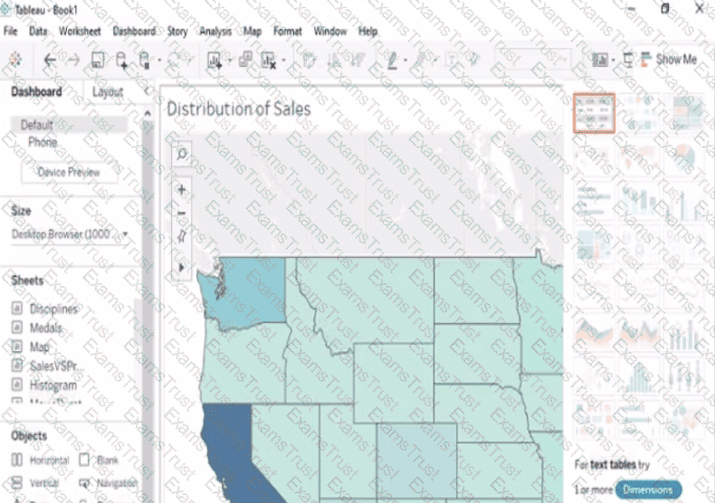
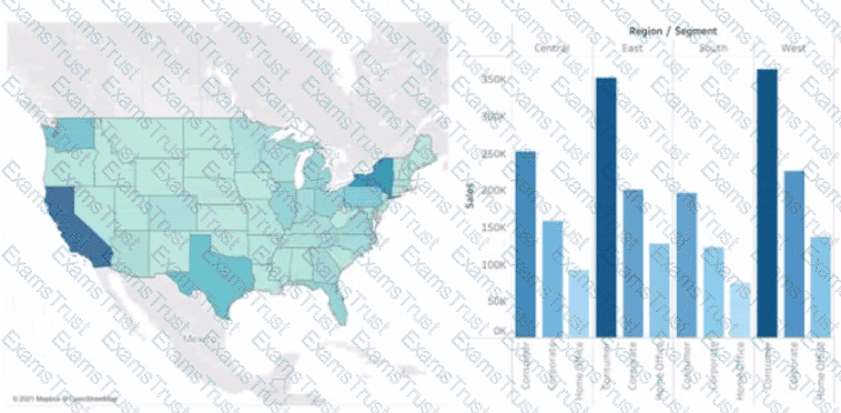
Open the Link to Book1 found on the desktop. Open Map worksheet and use Superstore data source.
Create a filed map to show the distribution of total Sales by State across the United States.
Open the link to Book1 found on the desktop. Open the Movie Durations worksheet.
Replace the existing data source with the Netflix_2019 data source.
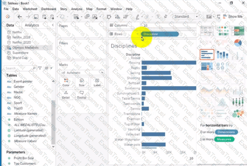
Open the link to Book1 found on the desktop. Open Disciplines worksheet.
Filter the table to show the Top 10 NOC based on the number of medals won.
Open the link to Book1 found on the desktop. Use the Superstore data source.
Split the Customer Name field into two fields named First Name and Last Name.
Open the link to Book1 found on the desktop. Open the sales dashboard.
Add the Sales by State sheet in a Show/Hide button to the right side of the dashboard.
Open the link to Book1 found on the desktop. Open the Line worksheet.
Modify the chart to show only main and max values of both measures in each region.
Open the link to Book1 found on the desktop. Open the Histogram worksheet and use the Superstone data source.
Create a histogram on the Quantity field by using bin size of 3.
Open the link to Book1 found on the desktop. Open SalesVSProfit worksheet.
Add a distribution band on Profit to show the standard deviation from- 1 to 1.
Open the link to Book1 found on the desktop. Open Disciplines worksheet.
Filter the table to show the members of the Top10 set and the members of the Bottom10 set. There should be a total of 20 rows.
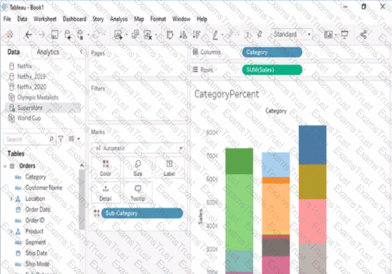
Open the link to Book1 found on the desktop. Open the CategoryPercentage worksheet.
Modify the bar chart show the percentage of sales for each Subcategory within every Category. The total percentage for every Category must be 100%.
You have the Mowing dashboard.
Which two elements are floating? Choose two.
You have a dashboard that contains confidential information about patients health. The data needs to always be up to date tor a team of healthcare workers How should you share me dashboard with the healthcare workers?
You publish a dashboard tut uses an attract. The extract refreshes every Monday at 10:00.
You need to ensure that the extract also refreshes on the last day of the month at 18:00.
What should you do?
You have the following data source in tableau Server.

You need to ensure that the data is updated every hour.
What should you select?
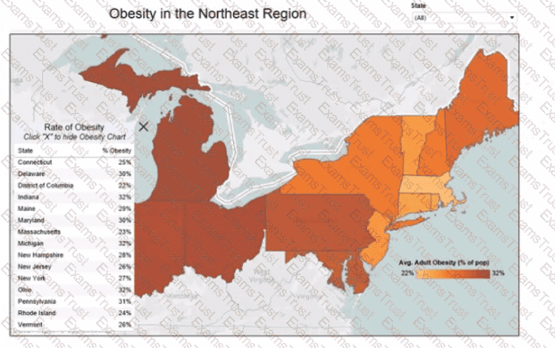
You want to add a comment to March 2020 as shown in the following visualization.
You have the following sets in a Tableau workbook
• Top N Customers
• Customers of 2020
• Top N Products
• Sellers of 2020
Which two sets can you combine? Choose two
You have the following tiled dashboard that has one sheet.
You want to replace the sheet with Sheet2.
What should you do?
You are the owner of an alert.
You receive an email notification that the alert was suspended
From where can you resume the suspended alert?
You have the following dashboard that contains two visualizations.
You want to show only one visualization at time. Users must be able to switch between visualizations.
What should you me?
You want to add a draft watermark to a dashboard as shown in the following exhibit.
Which type of object should you use?
You have the following two datasets:
• A Microsoft Excel worksheet that has two columns named Employee Name and Department
• A Microsoft SQL Server table that has three columns named Employee Name. Pay Grade and Team Size.
You want to use Tableau Prep to join the two datasets.
Which three actions should you perform in order? (Place the three correct options in order.)
A Data Analyst has the following dataset:
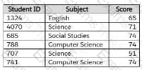
The analyst wants to create a new calculated dimension field named Category that meets the following conditions:
When Subject is Computer Science or Science, the Category must be Sciences.
When Subject is English or Social Studies, the Category must be Humanities.
Which two logical functions achieve this goal? (Choose two.)
You have the following dataset.
When you use the dataset in a worksheet, you want Sales to appear automatically as shown in the following table.
What should you do?
You subscribe to a view that delivers a daily email to your inbox.
You want to make the subscription available to other stakeholders.
What should you do?
A Data Analyst has the following view.
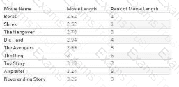
The analyst wants to filter the view to show only records that have a movie name starting with the word "The". The analyst must achieve the goal without writing any formulas.
Which type of filter should the analyst use?
You want to create the following table in a view.
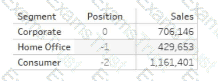
Which function should you use to create the Position column?
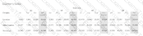
Which option must a Data Analyst enable to build the following table to add quarterly totals?
You have a data source that contains data tor every city in the Unites States. The following is a sample of the data.
You need to use the City dimension to create a dynamic filter that snows the cities that have a population greater than one million Which type of filter should you use?
In a dataset, a Data Analyst has a string field named Name that contains unnecessary semicolons.
Which function should the analyst use to remove the semicolons from the Name field?
You have the following dataset:
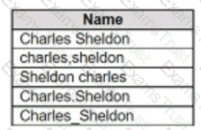
Which grouping option should you use in Tableau Prep to group all five names automatically?
A Data Analyst has the following dashboard.
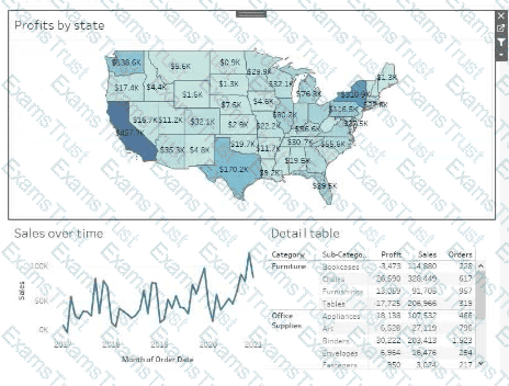
Currently, the map is used as a filter that affects the data on the other sheets of the dashboard.
The analyst needs to configure the dashboard to ensure that selecting a data point on the map only filters the Detail table.
What should the analyst do?
A colleague provides a Data Analyst with access to a folder that has the following files:
Sales.csv
Book1.json
Sales.tds
Export.mdb
Which file can contain information for connecting to an external data source, such as an SQL Server database?
A Data Analyst needs to update an existing dashboard. The current dashboard shows financial results data, and users have asked for a comparison of budgets to be added to the dashboard. A new data source has been created that includes both the actual costs and budgets and was published to the corporate Tableau site.
How should the analyst update the existing dashboard?
A Data Analyst is subscribed to several views.
The analyst needs to unsubscribe from the views.
What should the analyst use?
You have the following dataset in Microsoft Excel.
You are using Data interpreter to cleans the dataset. Data interpreter provides the following results.
How many rows of data will be ingested into Tableau as values?
When a Data Analyst needs to format workbook settings, which options are available in the Format Workbook panel?
You have the following dataset.
Which grouping option should you use m Tableau Prep to group al five names automatically?